Fit For Free
Unleashing an online fitness revolution with a modern digital platform
Fit For Free is a leading national gym operating under multiple brands: Fit For Free and SportCity. The ambition is to develop a scalable multi-brand online marketing and conversion machine that fits within the newly developed corporate identity.
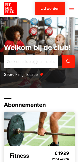
The first goal of the implementation was to increase the conversion rate. The old website worked poorly on mobile devices, while 70% of the web traffic came from there. By working together in a very close collaboration with the specialists of Fit for Free, we designed and built an intuitive mobile first checkout. As a result an enormous improvement in conversion was realized immediately.
Services
UX
Visual Design
Full Stack Web development
Contentful
Composable Commerce
Release
2021
Facilitating multibrand rollout
The content management system was outdated and content managers had difficulty using it. Moreover, the various brands were maintained from different platforms and using different techniques, which made updating and managing the websites a costly affair.
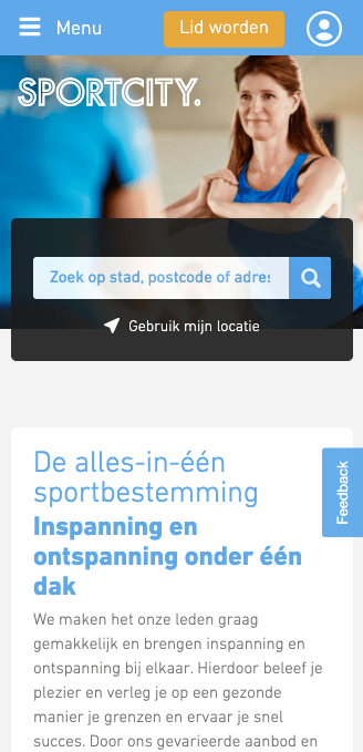
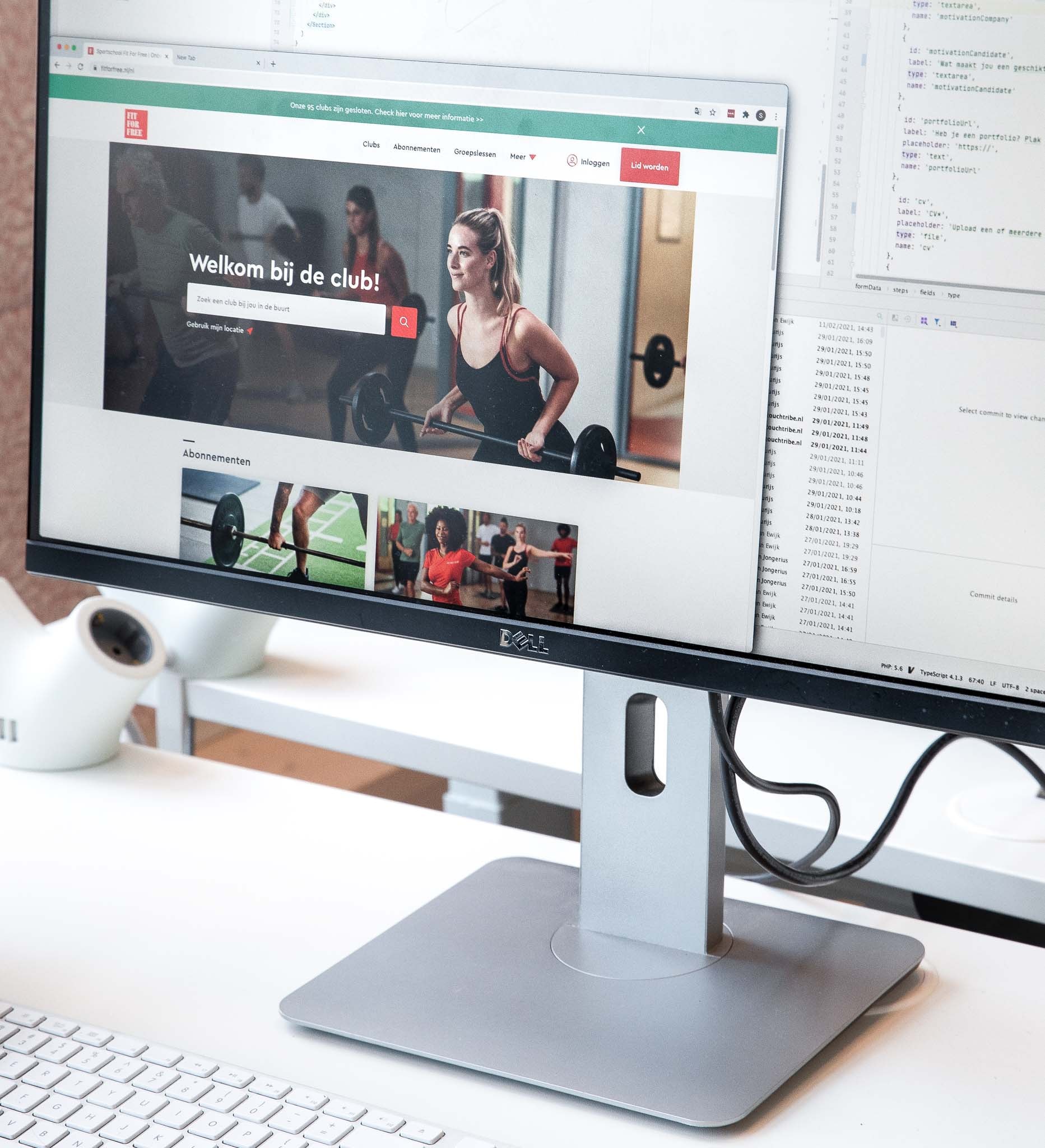
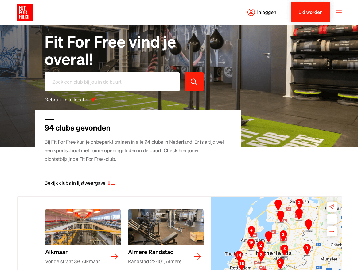
To make management more structured and efficient, we opted for a uniform setup for the different brands. A single CMS and a design system at the back end, which avoids duplication of effort but still gives each brand its own unique look and feel. From within the CMS, Fit for Free has complete freedom to compose unique pages that fit perfectly within the specific brand identity.
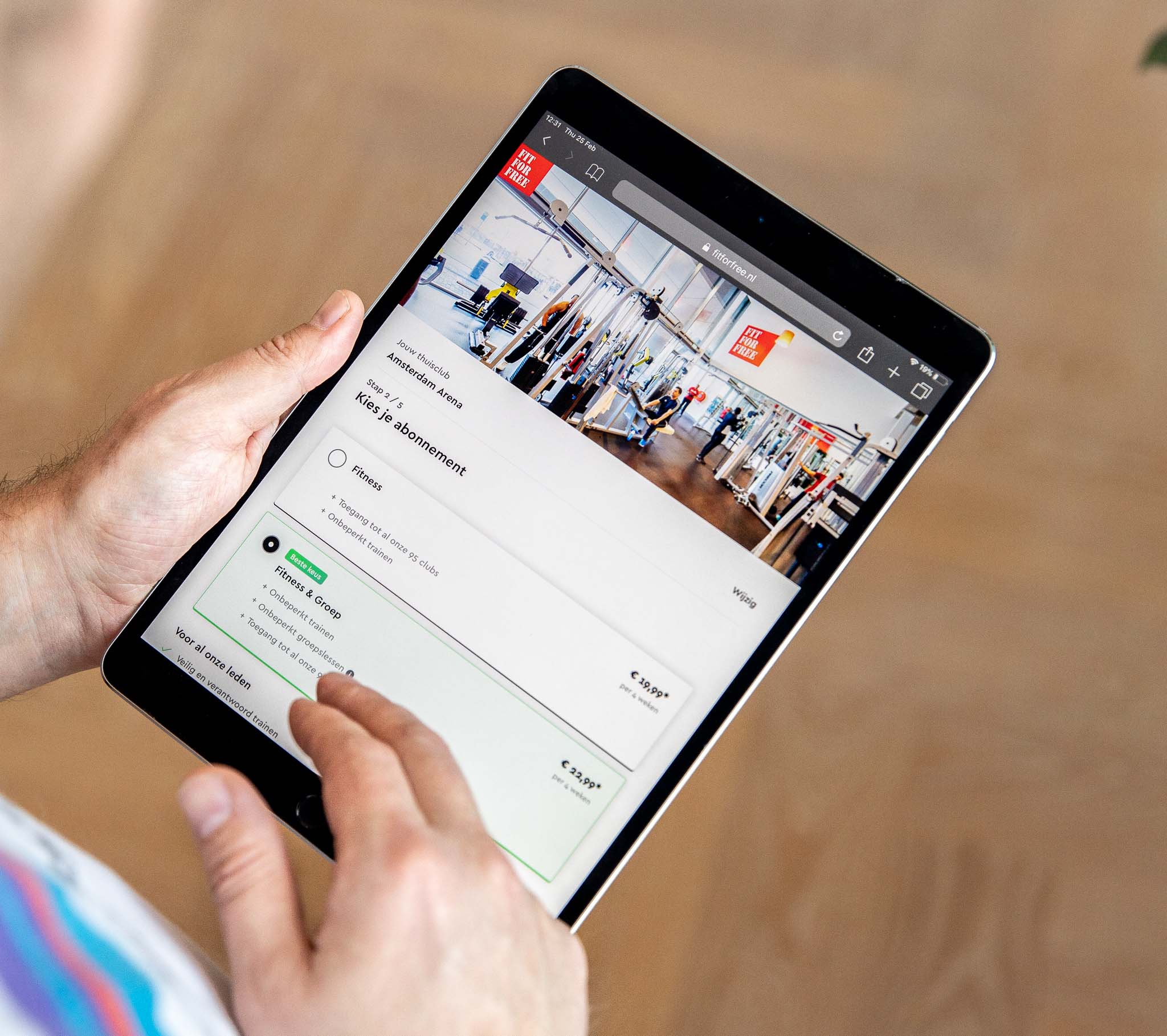
Design system as a starting point
As Fit For Free operates from two different brands, there was no central location where all brand and content elements were managed. This caused inconsistency in the user experience across the different websites. To solve this problem we introduced a design system. A design system is a central environment where all digital building blocks are available to everyone working on websites, marketing, communications and other digital expressions of a brand. Because the different teams use the same source, there is consistency in the development of websites and digital services, taking the user experience to a higher level. Moreover there is now speed and a feeling of empowerment for teams to self-drive, as much of the content can be self-managed by non-technical people.
Headless als basis voor schaalbaarheid
In a headless architecture the front-end of the e-commerce platform is separate from the backend systems within the digital landscape. This gives Fit For Free a lot of flexibility to design different channels according to their own needs and those of their target group.
Content can be tailored brand-independently and channel-specifically to give customers an optimal brand experience. Adjusting the front-end to experiment with new features, A/B testing, optimization, or rolling out new digital services, are among the possibilities here.
The e-commerce platform with headless architecture based on Contentful is future-proof and enables the organization to easily roll out new propositions or labels without affecting existing labels. The solution is also capable of delivering content on channels such as smartwatches, kiosks within gyms, or the mobile app, without impacting the platform's backend.
Ultimately the new website has significantly increased conversion which means more people start a healthier life
Requirements digital platform
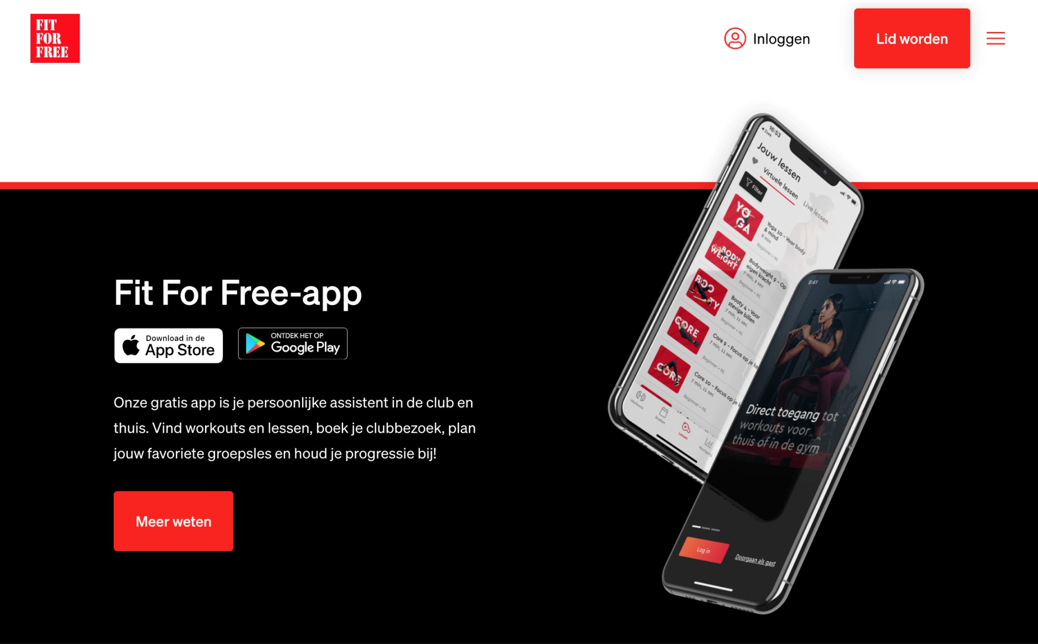
In order to facilitate the ambition of unleashing a digital fitness revolution, a number of requirements were drawn up for the new websites and the underlying content management system:
Everything must be mobile first
Must lead to higher conversion
Must facilitate a multi-brand strategy
More flexibility in the CMS
Link with ERP system Gym Manager
Cloud native to stay future proof
Must be configurable by non-technical staff
Implementation
Contenftul gives the editors and marketers of Fit For Free all the freedom to customize and expand the website. The system is very easy to use, but at the same time extremely powerful and agile.
For optimal speed and scalability, the front end of the website was built with React and NextJS. Of course, all best practices regarding SEO and headless were put into practice
Results
The most important result achieved a significantly higher conversion rate in the checkout of the Fit For Free website. In addition, the website has had an upgrade which makes the design more attractive, information is easier to find, and the content can be managed much better. And to top it all off: it works great on mobile.
95
Gyms
of Fit for free across the Netherlands
> 15%
higher conversion
compared to the old situation
Interesse in een headless oplossing?
Download onze whitepaper waarin we uitleggen waarom de toekomst van e-commerce headless is. Vul uw gegevens in en ontvang de whitepaper in uw mailbox.
